

Rock & Rockspace
Minimalist packaging designs
for consumer electronics
About
Rock and Rockspace are a Chinese electronic accessories brand for products such as cables, phone cases, and portable chargers.
We were given the brand and packaging guidelines for both Rock and Rockspace and were asked to create a series of packaging designs to refresh their current products. As the lead designer in this line, my responsibilities were to create both the 3-D and 2-D aspects of these designs.
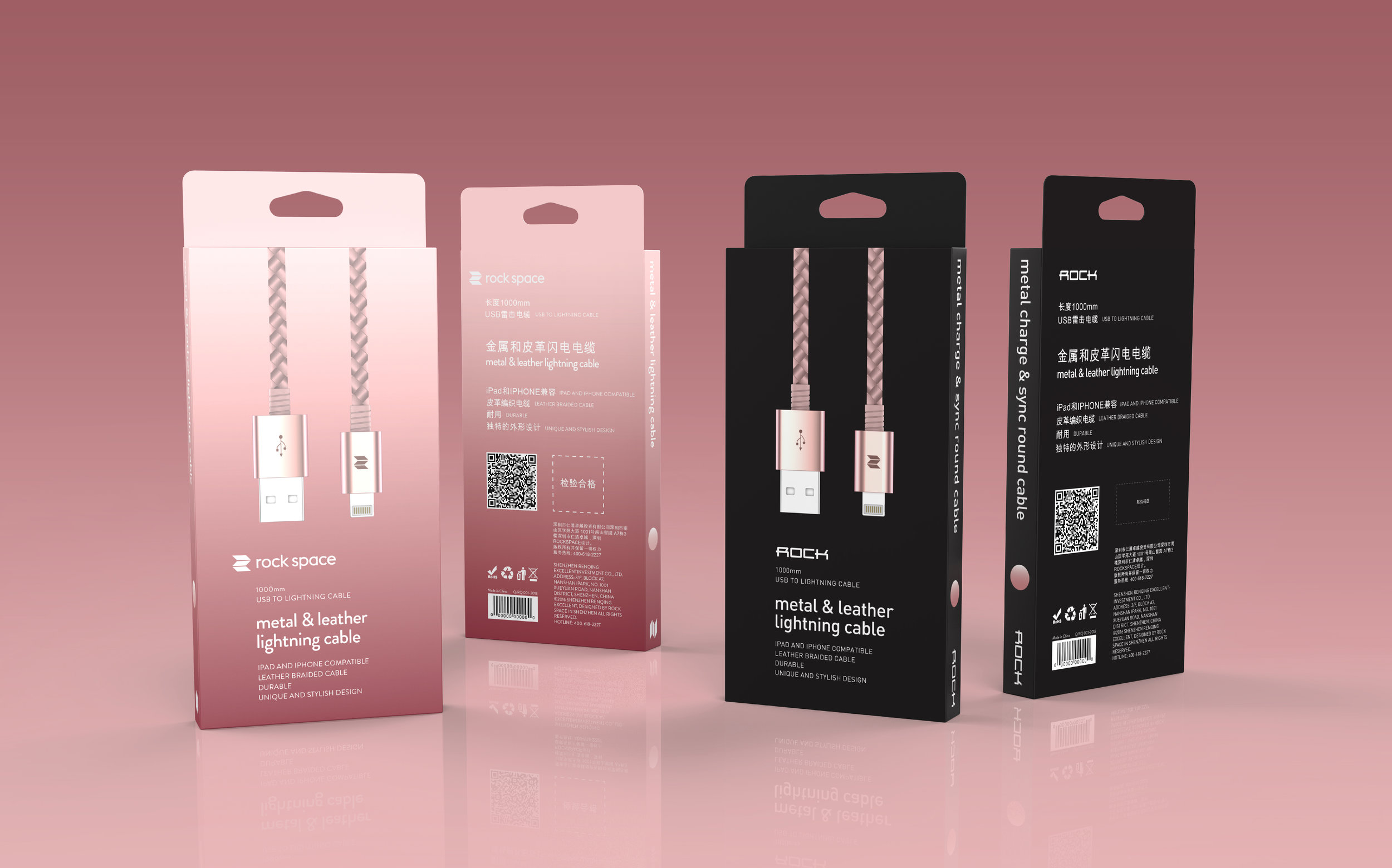
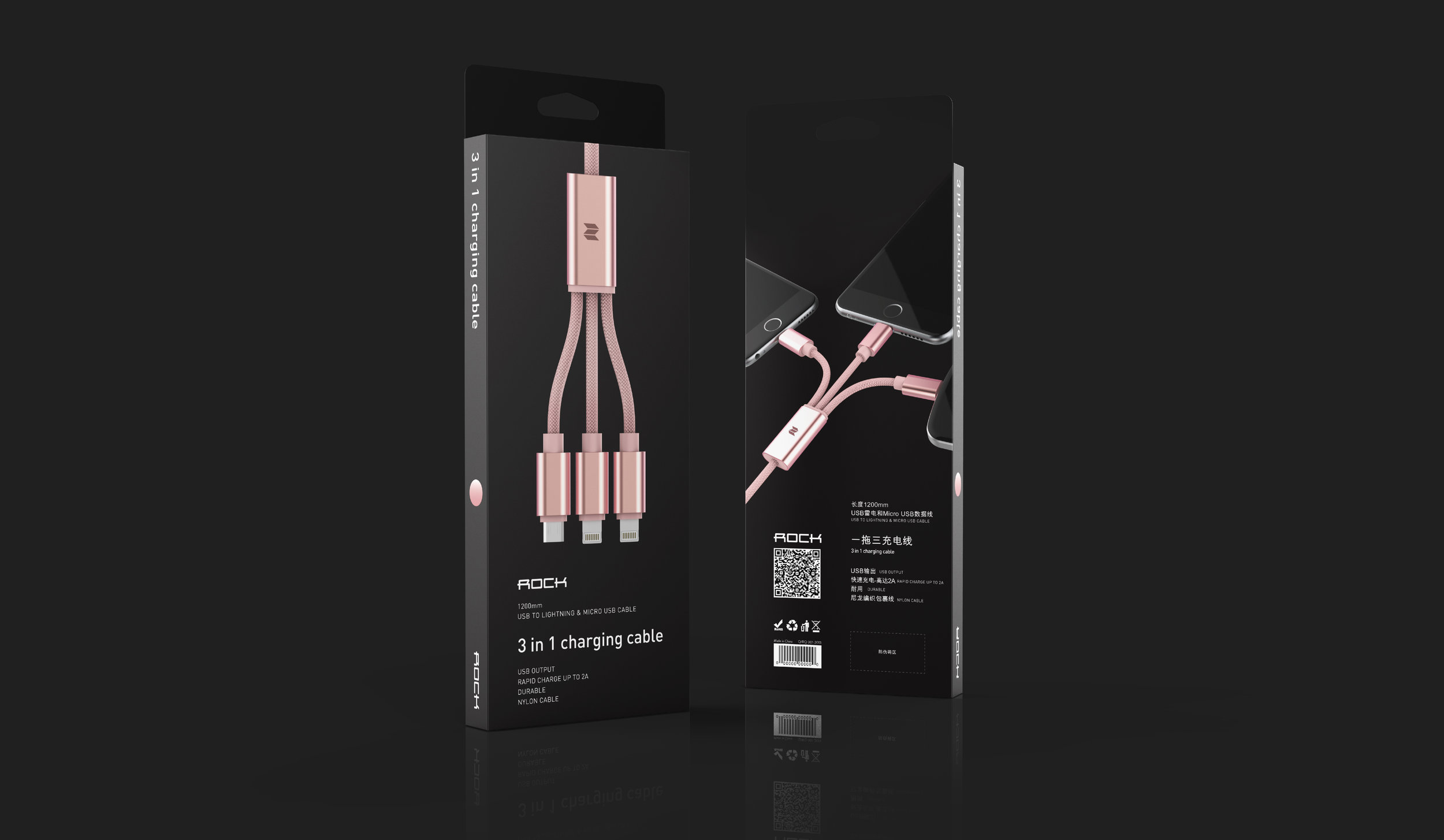
Rock Packaging

Rock packaging dedicates itself to highlighting the beauty of the product. The product takes center stage by use of beautiful renders and windows looking directly at the products orthographic view.
Rock uses black as its primary color. Any secondary colors within the black space are those that relate to specific product colors within packaging. Otherwise, silver foil is used extensively as a highlight detail with type and icons.


Rockspace Packaging

Rockspace packaging dedicates itself to highlighting the beauty of the product. The product takes center stage by use of beautiful renders and windows looking directly at the products orthographic view.
Packaging is inspired by the color of product, using a gradial tone on tone color spectrum.


